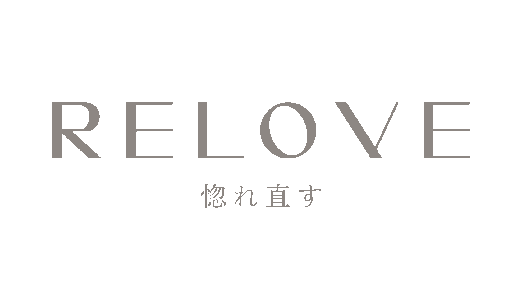
LOGOTYPE
Creation of a logo consisting of a font inscription and a sign.
BRANDING
Creation of a unique color brand identity and selection of font combinations for the brand.
IDENTITY
Creative of corporate identity elements and brand guidelines.

technical

ABOUT
Relove is about falling in love with yourself and your comfort because the quality of materials affects the quality of sleep and self-care. This is a young brand from Moscow specializing in home textiles and bedding. One of the brand's core values is to make sleep and time spent in the bedroom as comfortable and beautiful as possible. The brand's slogan is: "The most interesting things happen in bed."
CONCEPT
Before starting our work, we researched the origin of the word RELOVE. It turns out that in Japanese, there is a wonderful verb 惚れ直す (horenaosu, "to fall in love again")—when a familiar, beloved partner suddenly reveals a new, endlessly charming or cool side, and you’re overwhelmed by the feeling: "Wow, I love them so much." This verb fits perfectly into the brand's philosophy, as one of the key advantages of the brand is that the fabrics were specially ordered from Japan.
PROCESS
We started by experimenting with prints that show the texture of crumpled bed linen. The aesthetic of "wrinkled" bedding has long held a special place. Then, we moved on to sketching the logo and the key branding element—a postcard. The postcard is a special compliment from RELOVE, offering the first tactile introduction to the brand.
Given the bold name of the brand, we brainstormed ideas for the postcard format. What if we moved away from the typical A4 or A5 sizes? While sketching a standard postcard, we felt it lacked a "wow" factor. So, we decided to play with the popular arched shape and create something reminiscent of a Valentine card. Our exploration of the right color palette and logo design can be seen below.
Given the bold name of the brand, we brainstormed ideas for the postcard format. What if we moved away from the typical A4 or A5 sizes? While sketching a standard postcard, we felt it lacked a "wow" factor. So, we decided to play with the popular arched shape and create something reminiscent of a Valentine card. Our exploration of the right color palette and logo design can be seen below.


AUTHORS
Creative produce: Ruzanna Avetisian
Graphic design: Daria Trybus
Graphic design: Daria Trybus

